Showing posts with label watercolor. Show all posts

Tuesday, September 3, 2013

Albrecht Durer: Master Drawings, Watercolors and Prints from the Albertina


The Albertina in Vienna, Austria is a museum known for it outstanding collection of works on paper.  The Albertina maintains a large collection of watercolors, drawings and prints by the Northern Renaissance master Albrecht Durer (1471-1528). This past spring the Albertina lent this vast and impressive collection to the National Gallery of Art in Washington, DC.

                                Self-portrait by Albrecht Durer, 1500, oil painting.

Durer is known in the history of art for his intense self-portraits, thought by many scholars to be the first self-portraits ever created. Indeed what scholars believe is the first self portrait made by an artist is in the exhibition. It is  a small detailed silverpoint drawing completed by Durer when he was just 13 years old.  (For more information about the silverpoint technique see my blog posting:mariedauenheimer.blogspot.com/.../silverpoint-drawing-history-and.html‎)

                    Self-portrait by Albrecht Durer, 1484, silverpoint on prepared paper.

In 1505 Durer travelled to Venice and developed one of his most elegant drawing techniques.Using a medium blue Venetian paper (made from blue rags) Durer drew with white gouache and dark ink to create luminous, chiaroscuro drawings. 

The Head of an Angel by Albrecht Durer, 1506, brush and ink with wash, heightened with white on blue paper.

When Durer traveled back to Germany he did not take this Venetian paper with him, but started making his own paper prepared with a ground, usually blue, but sometimes green and gray. This is how Durer made one of his most icon drawings “The Praying Hands”. The drawing was created in 1508 as a study for an altarpiece for a Frankfurt church (which burned down in 1724). The drawing was done as a part of a larger study of one of the apostles. The drawing was later cut down and made into two separate drawings.  (see below).

Praying Hands by Albrecht Durer, 1508, brush and wash, heightened with white on blue prepared paper.

Durer introduced many important artistic traditions to his Northern European colleagues. His use of linear perspective, masterfully complex woodcuts and engravings transformed printmaking. Durer’s treatises on human anatomy and proportion transformed the way artists depicted the figure. Finally, like Leonardo, Durer was fascinated with the overlap of science and art.

                         Male Nude by Albrecht Durer, 1513, pen and brown ink on paper.

Indeed in Durer’s sublime watercolor “The Great Piece of Turf” (1503) his art “creates a balance between scientific observation and artistic poetry”.

The Great Piece of Turf  by Albrecht Durer, 1503, watercolor and gouache on paper.

In 1514 Durer experienced a personal crisis when his mother died. During his mourning he created his “master prints” about despair and death. They include his print of St. Jerome for which he did his magnificent study.

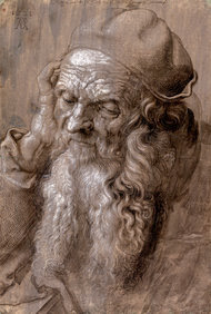
An Elderly Man of Ninety-Three Years by Albrecht Durer, 1521, brush and ink, heightened with white on gray-violet  prepared paper.

The National Gallery of Art exhibits closed in June. However I highly recommend the superb catalog published by the National Gallery of Art.It is called "Albrecht Durer, Master Drawings, Watercolors and prints from the Albertina" by Andrew Robison and Klaus Albrecht Schroder.


Sunday, March 10, 2013

Watercolor Wash Drawing with Robert Liberace


As many of you know I frequently blog about master drawings and the process of how they were created.  I am currently taking a master drawing techniques class at the Art League in Alexandria, Virginia.  The instructor, the renowned Robert Liberace, is an accomplished painter, draughtsman and sculptor.

                   Model Lily Dunlap with Robert Liberace as he sets up the pose.

In todays class Liberace created two very different portraits using watercolor washes.  The portraits were of my husband and daughter who modeled in 18th costume.

              Robert Liberace working on painting of Lily in 18th century costume.

For Liberace the process starts with setting up the pose and lighting.  As he choreographs the pose he thinks about the light, form, pattern and composition.  For the watercolor painting he did of Lily he used a monochromatic watercolor wash on Twinrocker handmade paper.  Watercolor wash, unlike ink wash, can be moved around and manipulated, ink wash tends to stain the paper.

                         Watercolor wash painting of Lily by Robert Liberace.

As Liberace builds up the form he is conscious of not over working the dress, he wants to keep the image fresh and fluid.  He lets the white of the paper show through as the highlights and lighter values. he uses dark accents to describe areas of shadow.  The fluidity of his brushwork is remeniscent of Tiepolo. The figure’s dress and pose recall Rococo artists such as Watteau and Fragonard.

                                      Sam Dunlap posing as a buccaneer.

For the watercolor portrait of Sam, as a buccaneer, Liberace started with a light graphite sketch and progressed to blocking in the flat areas of color with light washes.  As he worked he carefully observed the model and the nuances of light, shadow and color temperature.  The resulting portrait is a sensitive study, done with a confident and energetic brushwork, that captures the character of the sitter.


                      Watercolor wash portrait of Sam by Robert Liberace.

Monday, February 4, 2013

“Color Line Light” Drawing exhibition at the National Gallery of Art


Yesterday I saw the new drawing exhibition, “Color, Line, Light,French Drawings, Watercolors and Pastels from Delacroix to Signac” at the National Gallery of Art in Washington, DC. The show was organized with Musée des Impressionnismes, Giverny and is on view in Washington, DC until May 26, 2013.

A wonderful antidote for the doldrums of winter this exhibition includes an impressive array of drawings, many in full color, from the mid 19th century to the early 20th century.  The 100 works, from the collection of James T. Dyke, show off many brilliant drawing techniques and subject matters ranging from landscape, still life to figures and portraits. Indeed this exhibition will make you reach for neglected art materials and experiment!

          Paul Signac, Barges on the Seine at Samois, 1900, Watercolor and gouache.

The drawing techniques showcased in this broadly ranging show includes watercolor, gouache, pen and ink, charcoal, pastel and mixed medium. The periods of art represented include romanticism, realism, impressionism, postimpressionism, pointillism (neoimpressionism), symbolism and the Nabis.

                                   Paul Huet, A Meadow at Sunset, pastel.


Watercolor techniques range from the tightly rendered paintings of Alexandre Calame, the confident brushwork of Gustave Dore, to the fresh and freely painted pointillist works by Paul Signac.

                     Gustave Dore, A River Gorge in a Mountain Landscape, watercolor.

Charcoal drawings range from a luminous figure study by Albert Besnard to the dark, ominous, tonal work of Charles Angrand and sensitive realism of Leon Augustin Lhermitte.

Leon Augustin Lhermitte, An Elderly Peasant Women, charcoal.

The show features the use of pastels, which in the 19th century became a favored medium by many artists thanks to the development of richer pigmented chalk pastels.  Paul Huet uses a bright palette to layer color in describing a meadow at sunset.  While Auguste Louis Lepere uses an analogous palette of pastels to draw a pastoral scene.

                Auguste Louis Lepere, Chestnut Trees above a River, 1900, pastel.

It is often thought that the impressionist artists didn’t create many drawings as they painted spontaneously from life. This show offers many opportunities to see impressionist works on paper. An atmospheric pastel drawing by Claude Monet was done in London while he waited for his oils paints to arrive. Edgar Degas is one of many impressionist artists who enjoyed drawing techniques.  The exhibition includes a few masterful drawings by Degas they are inspired in their use of the compositional space and in there animated effects.

                       Edgar Degas, A Dancer at the Bar, charcoal and white chalk.

I recommend an excursion to the National Gallery of Art to see this inspired exhibition.  I also recommend the exhibition catalog.

Monday, January 7, 2013

"Beatrix Potter, the Picture Letters" at the Morgan Library


Beatrix Potter (1866-1943) is known to many as the creator of The Tale of Peter Rabbit and many other children’s stories. What may not be know is that Beatrix Potter was an accomplished scientific illustrator and an astute businesswoman.  Both of these attributes added to her success as a children’s book author and illustrator.

                          Beatrix Potter and her pet rabbit "Benjamin Bouncer" 

Beatrix Potter was born in London in 1866 into an affluent family.  She enjoyed time at her family’s city home and in the countryside.  Beatrix and her brother Bertram had a menargie that included mice, rabbits and a hedgehog.  When the family travelled to the countryside Beatrix was fascinated with her natural surroundings and explored them through drawing.

                        Beatrix Potter's watercolor drawing of "Boar Fish", 1895.

   Beatrix Potter watercolor and pen and ink drawing of "Studies of a Dead Thrush", 1902.

The “Beatrix Potter, The Picture Letters” exhibition at the Morgan Library in New York is a must see for any Potter enthusiast.  The show focuses on Beatrix Potter’s many beautifully illustrated letters she wrote to children.  She corresponded with over forty children including her former governesses’ family.  Perhaps her most important correspondence was with young Noel Moore for whom she wrote the Tale of Peter Rabbit complete with lively pen and ink drawings.  The model for Peter was Beatrix Potter’s own pet rabbit that she described as “An affectionate companion and quite friend.”

                           Beatrix Potter's sketches of her pet rabbit Peter, 1899.

Beatrix attributed her success to the fact that her stories were written for “real children"- indeed a particular child.  Her studies of animals from life and scientific investigation of mushrooms, plants and landscape add an unusual freshness to her illustrations.  The animals are not mawkish or oversentimental.  Her animal characters keep a sense of the animal they are drawn from.

         Beatrix Potter's illustrated letter "Peter's Dream of a Comfortable Bed" 1899.

The exhibition includes early board games, stuffed animals and figurines based on the various Potter stories, ever the businesswoman Potter kept copyright and control of her famous characters.

            Beatrix Potter's watercolor and pen and ink drawing "His mother put him to bed, 
            and made some camomille tea", 1907.

I highly recommend a visit to the Morgan Library to enjoy this delightful exhibition!

Sunday, November 25, 2012

Ellsworth Kelly's "Plant Drawings" exhibition


This past summer, while in New York, I saw two amazing and very diverse drawing exhibitions at the Metropolitan Museum of Art. The shows were “Ellsworth Kelly Plant Drawings, 1948-2010” and  “Durer and Beyond, Central European Drawings, 1400-1700”.  Both exhibitions highlighted an abundance of drawings created using line.

                                                Sunflower, 1957 watercolor

Ellsworth Kelly is an American artist born in 1923 and best known for his minimalist works.  Kelly embraced the Color Field School in the 1960s and became known for his vibrant, clean minimalist paintings and sculptures. Regarding his interest in simple, minimal shapes and contours Kelly stated " I'm not interested in the texture of a rock, but it's shadow."

                                                       Hyacinth, 1949, ink

The exhibition at the Met focused on Kelly’s plant drawings, created over a sixty year period. These simple elegant drawings, made with graphite or ink on paper or with watercolor, are stunning for their simple use of line and shape.  Kelly is a master of composition, integrating negative and positive shape and keen observation skills.  Indeed, his drawings read as portraits of an individual plant.

                                        Study for "Plant I", 1949, ink and pencil


While most of the pieces are 18 x 20 inches, there are some monumental drawings that utilize a strong vertical composition.  The overlapping of shapes and form create a sense of motion.

                                           Four Sunflowers, 1957, pencil

I highly recommend the exhibition catalog  “Ellsworth Kelly Plant Drawings” by Michael Semff and Marla Prather.  It is a beautiful publication and includes a comprehensive interview with Kelly conducted by Marla Prather in 2011.

I will be posting about the “Durer and Beyond” exhibition in the near future.